This Is What the 2008 Electoral Map Would Look Like if the Election Were Decided by [Fill In the Blank]
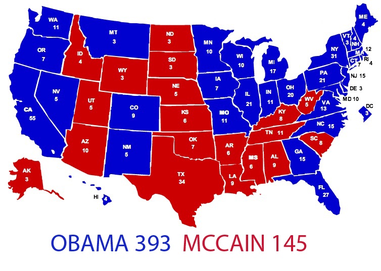
A number of sites have featured a hypothetical electoral map entitled This Is What the 2008 Electoral Map Would Look Like if the Election Were Decided by 18-29
Jul 31, 2020670.1K Shares13.1M Views
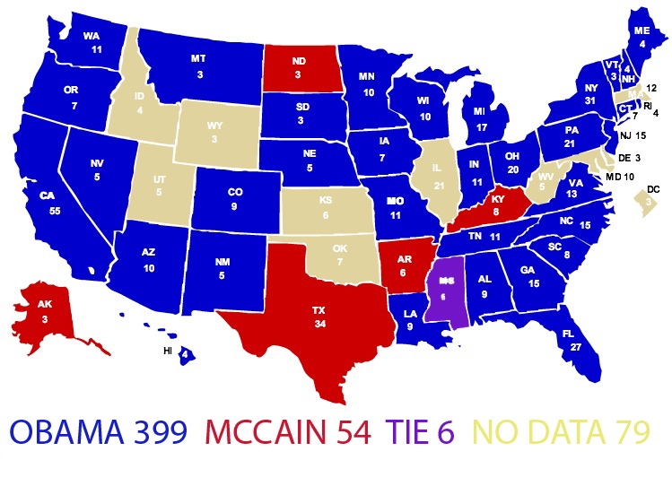
A number of sites have featured a hypothetical electoral mapentitled “This Is What the 2008 Electoral Map Would Look Like if the Election Were Decided by 18-29 Year Olds.” Needless to say, it’s a very blue map.
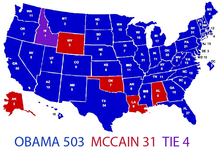
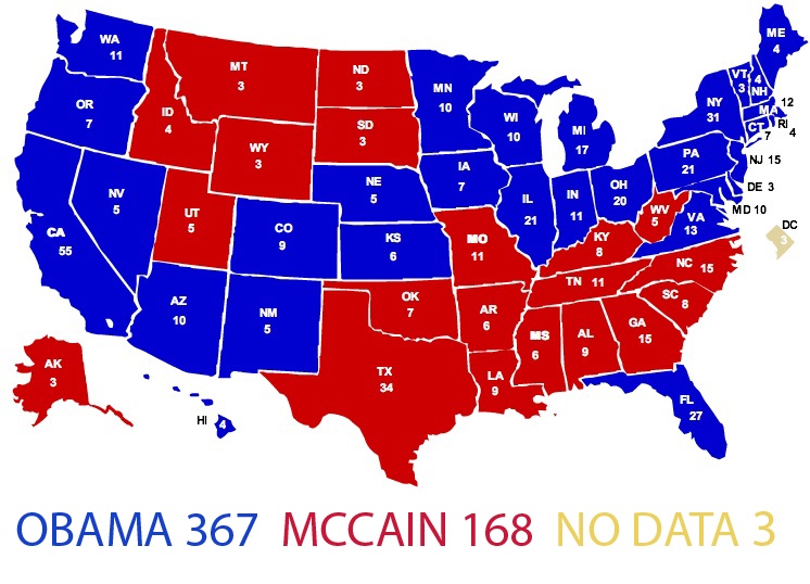
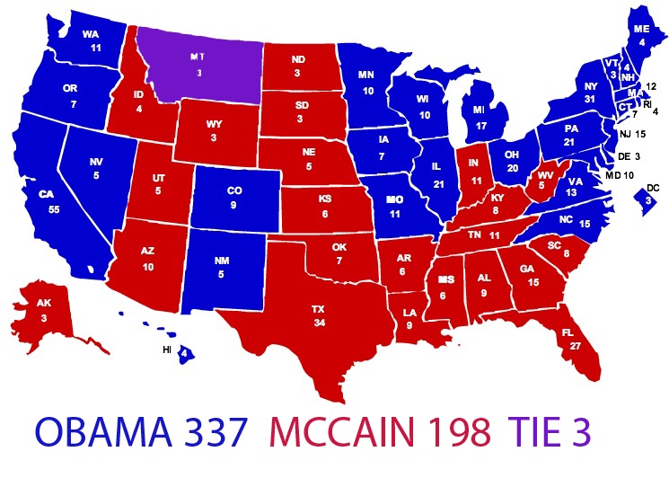
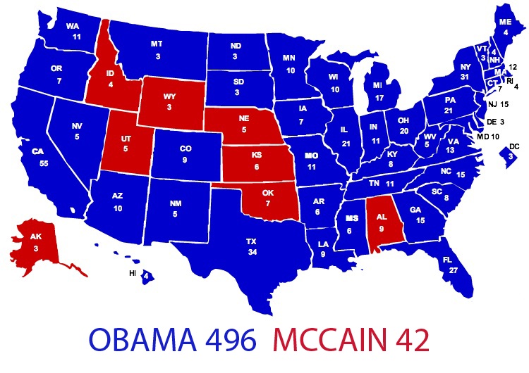
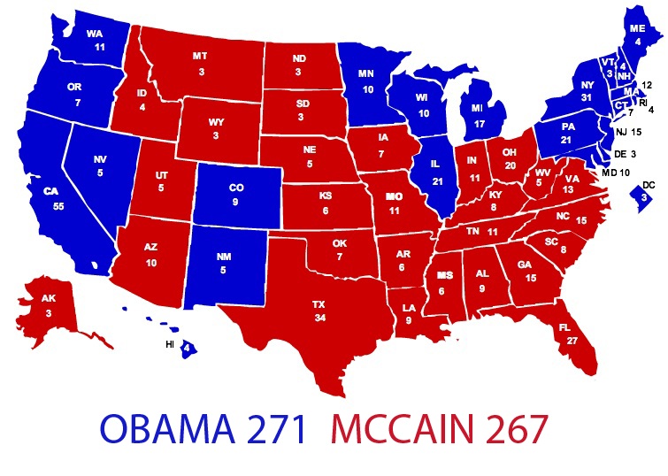
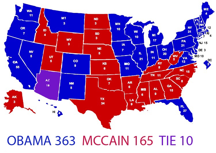
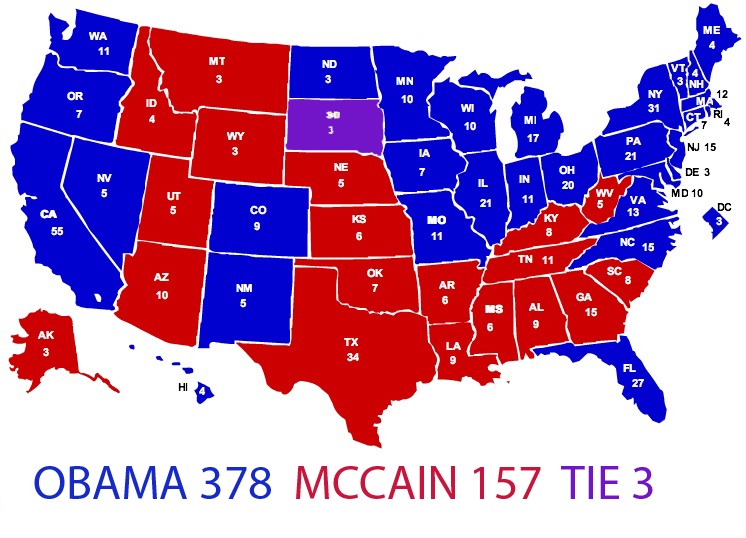
I spent the weekend poring over the CNN exit pollsfrom last Tuesday’s election and converting the state-by-state data for a number of demographics into my own hypothetical electoral maps.
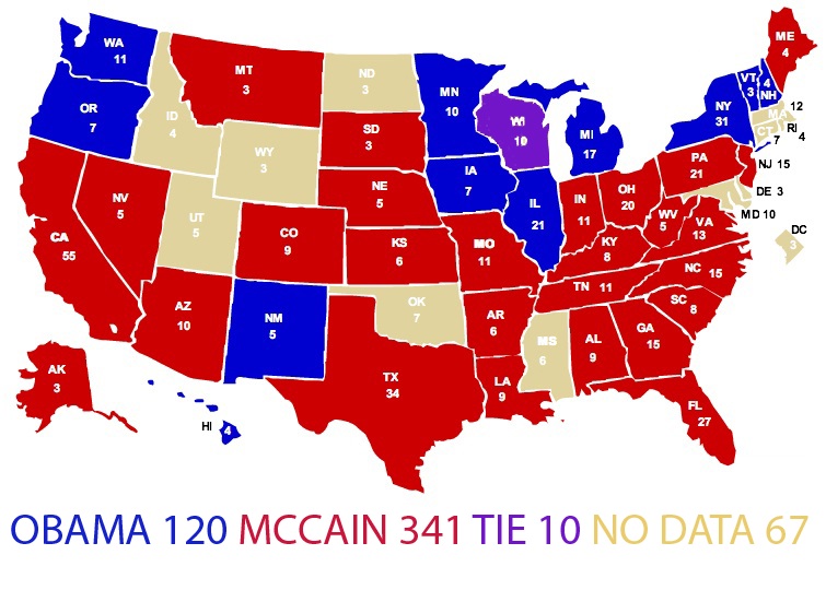
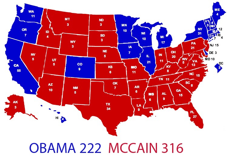
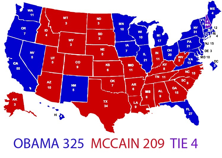
The result is a set of maps that visualize the outcome of an election decided exclusively by the following age groups, genders, income groups, political affiliations, etc.:
Voters age 65 and older:
**White voters: **(A “black voters” map would be a sea of blue.)
Men:
Women:
Self-described political moderates:
Registered independents:
College graduates:
Voters earning under $50,000 per year:
Voters earning over $50,000 per year:
Voters who are “worried about economic conditions”:
Voters whose “most important issue” was the economy:
Voters whose “most important issue” was the war in Iraq:

Hajra Shannon
Reviewer
Hajra Shannona is a highly experienced journalist with over 9 years of expertise in news writing, investigative reporting, and political analysis.
She holds a Bachelor's degree in Journalism from Columbia University and has contributed to reputable publications focusing on global affairs, human rights, and environmental sustainability.
Hajra's authoritative voice and trustworthy reporting reflect her commitment to delivering insightful news content.
Beyond journalism, she enjoys exploring new cultures through travel and pursuing outdoor photography
Latest Articles
Popular Articles
